

writingdesignbrand
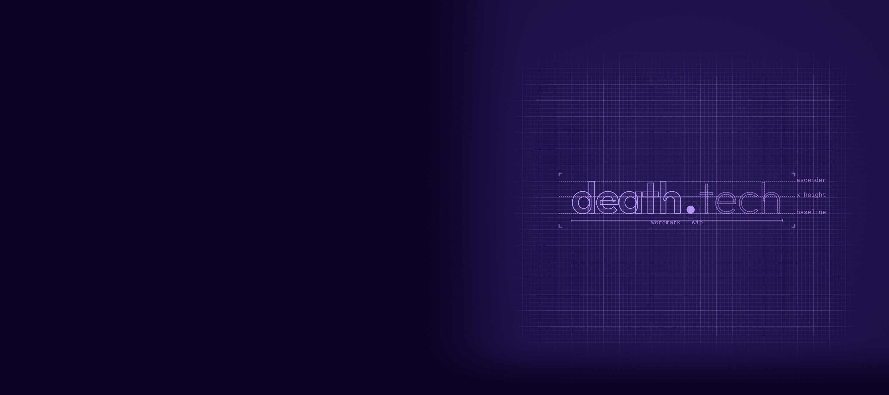
Zero to death.tech: how & why we created our own brand
How the engineering team got a look of its own: a name that says it out loud, brand guidelines with a linter, and Zero, a small purple pixel-art octopus.

Leehead of technology
· 3 min read
This started as a side project.
We were putting together a careers page and realised the engineering team didn’t really have a look of its own. Octopus Legacy’s brand is warm and thoughtful, made for families planning ahead or dealing with a loss. It’s great at that job. It just didn’t capture the team: the running jokes in code review, the emoji we react with in Slack, the way we talk about our work.
So we spent some spare time giving the team a personality on screen. No agency, no six-month process. It just had to feel like us.
A name that says it out loud
We started with a working name, OLTech. It was accurate and completely forgettable.
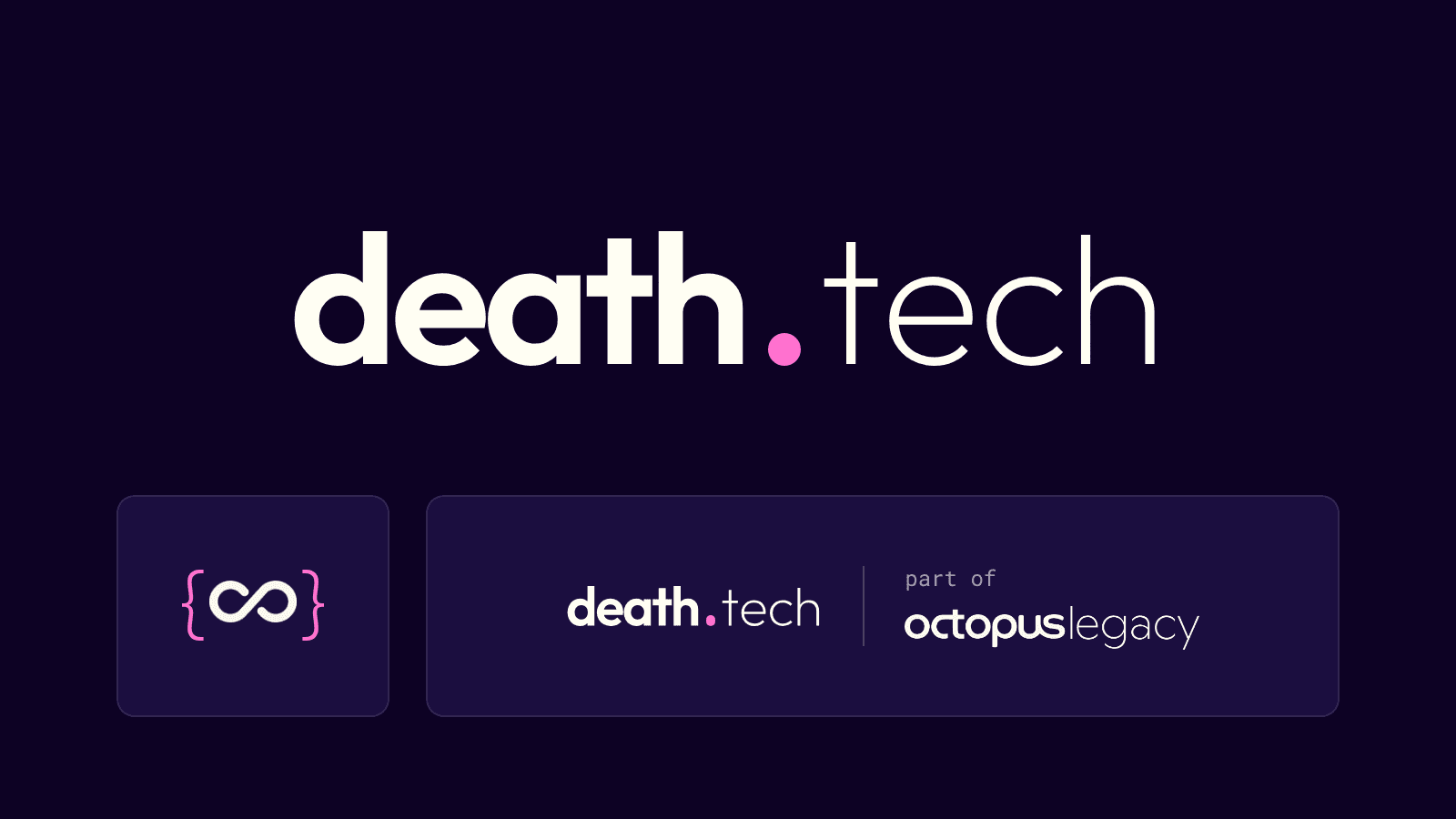
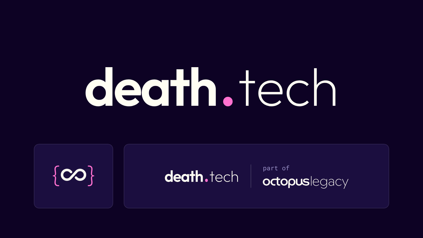
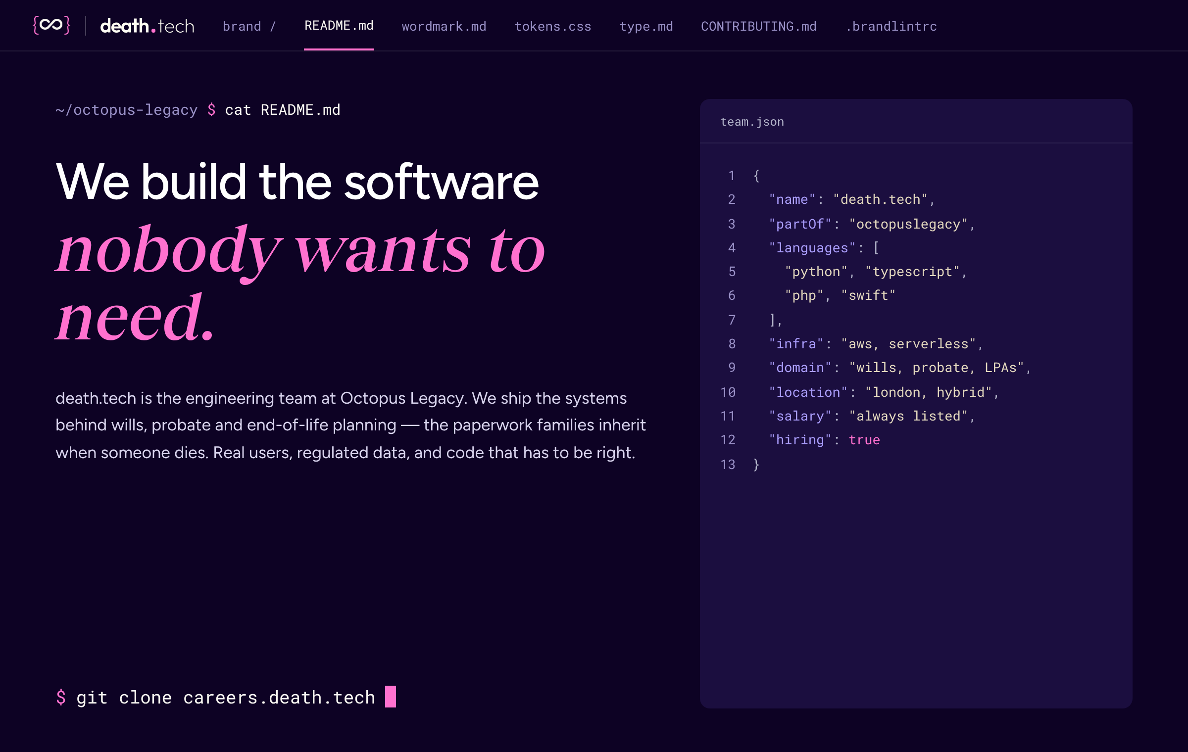
death.tech says what we actually do, in two words and a dot. It also looks like something you’d type into a terminal, which we liked.
It’s always lowercase and always has the dot, even at the start of a sentence. Our spellcheckers have opinions about that.
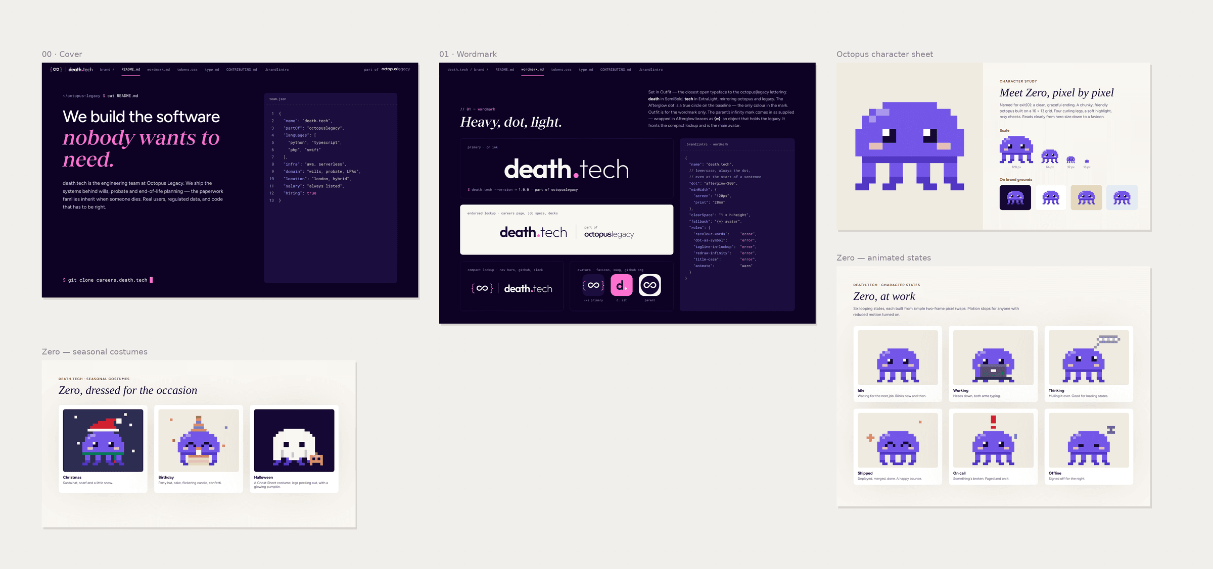
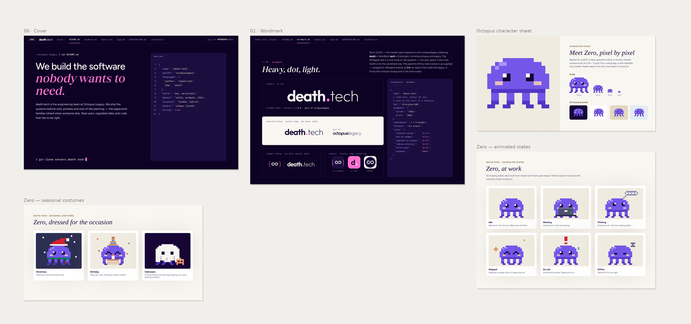
For small spaces, like a GitHub avatar or a Slack icon, we wrapped the Octopus Legacy infinity mark in curly braces: {∞}. An object that holds the legacy. We were quite pleased with that one.
Making it feel like home
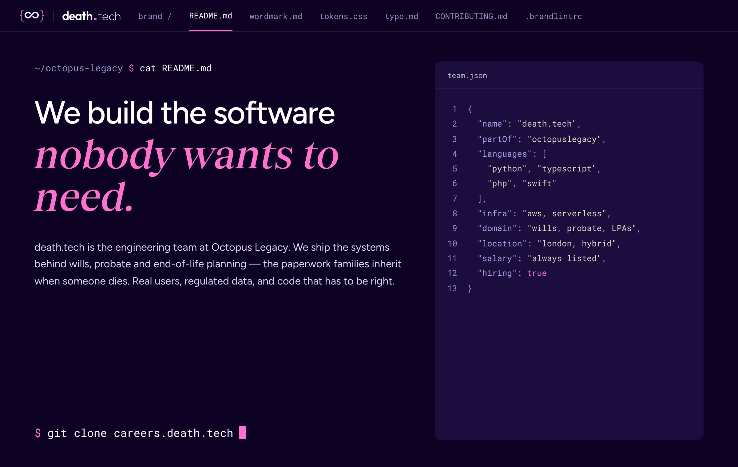
We wanted the brand to feel like the tools we already spend our days in.
So it’s dark, like our editors. Labels and tags are in monospace. The colours double as a syntax theme, so code on the site looks like it belongs there. Ask the careers page whoami and it answers “curious engineer, probably”.
We even organised the brand guide like a repository, with a README and a lint file of rules. Yes, our brand guidelines have a linter.
The writing rules are short: write it like a good pull request description. Be specific, be honest about the trade-offs, and keep it dry rather than jokey.
Meet Zero
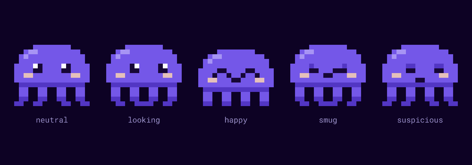
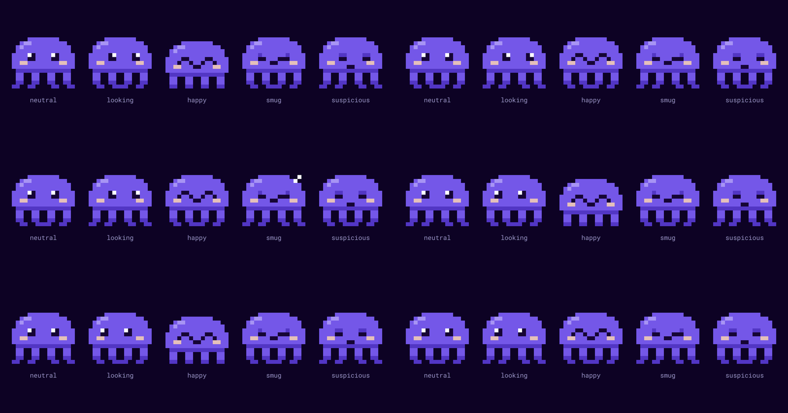
With a name like Octopus Legacy in the family, an octopus was always going to turn up.
Zero is a small purple pixel-art octopus. The name comes from exit(0), the code a program returns when it ends cleanly: a quiet nod to the work we do, helping people make a clean exit. Zero is friendly, curious and a bit cheeky, and reacts to engineering life the way the rest of us do.
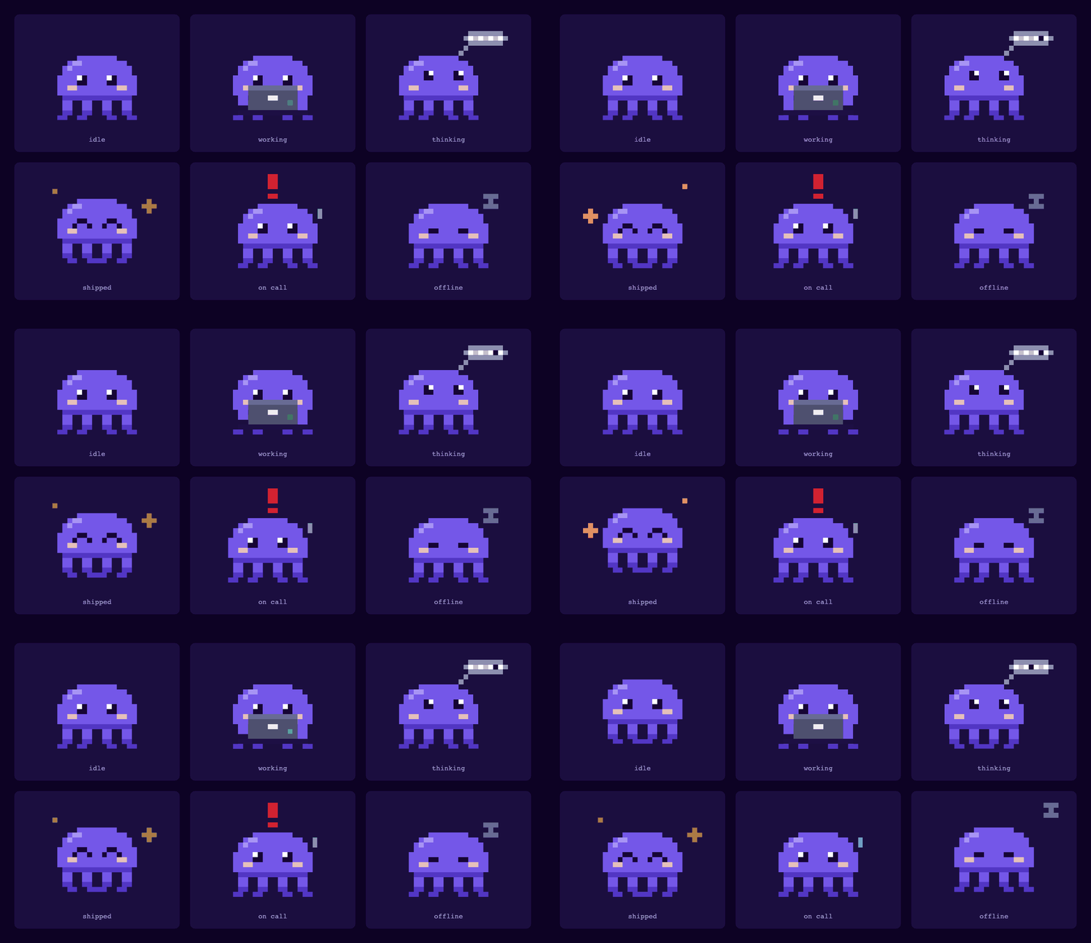
Zero is drawn on a 16 by 13 pixel grid, and nearly all of the expression comes from the eyes. Move a couple of pixels and Zero goes from pleased with themselves to deeply suspicious of your pull request.
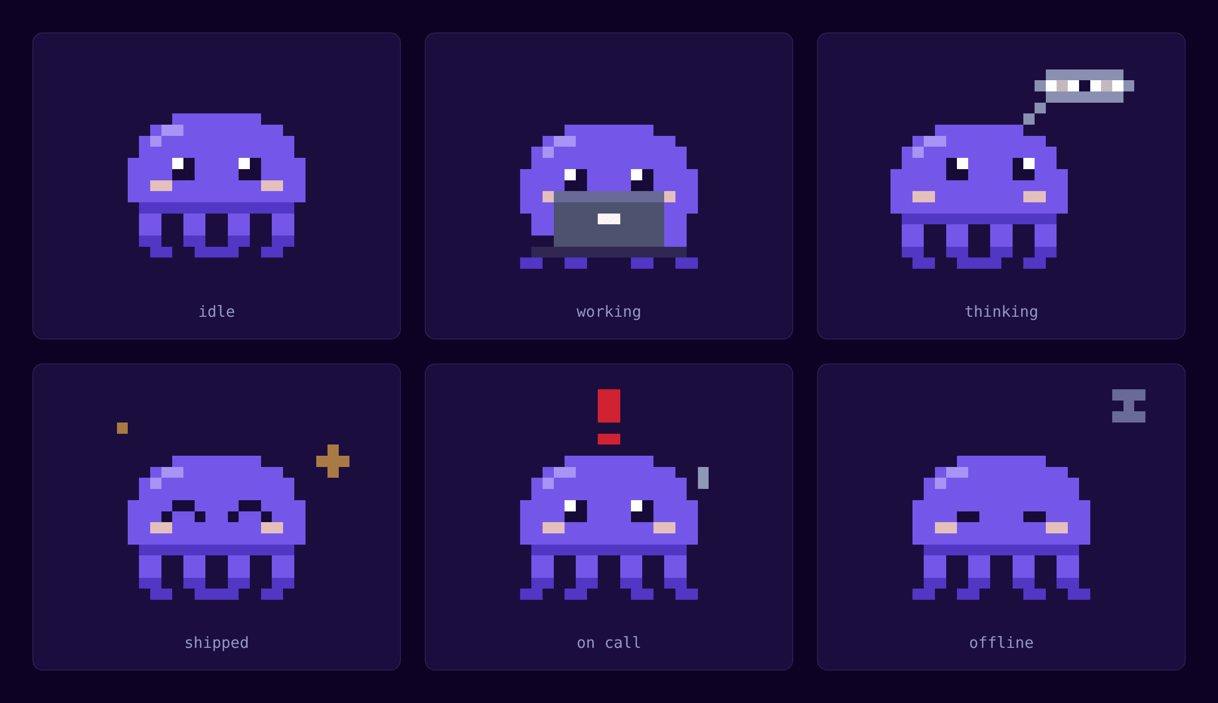
Zero moves like a sprite from an old game, swapping whole frames rather than sliding smoothly. They idle and blink, type away while working, think with a little bubble while something loads, bounce when we ship, panic when something breaks, and fall asleep when offline.
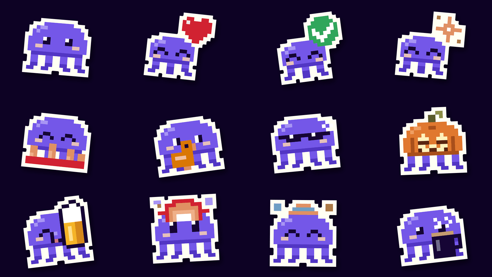
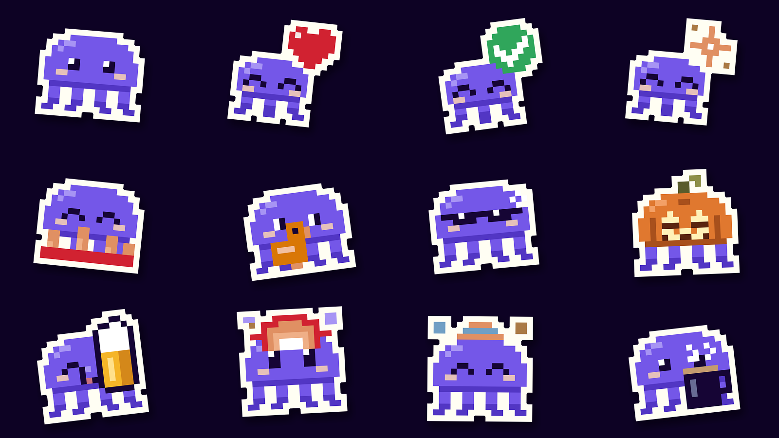
Zero has also taken over our Slack. There are more than thirty Zero emoji now, including the one we use to approve pull requests, plus outfits for Christmas, birthdays and Halloween. The Halloween one is a ghost sheet with four legs poking out the bottom.
Zero at work
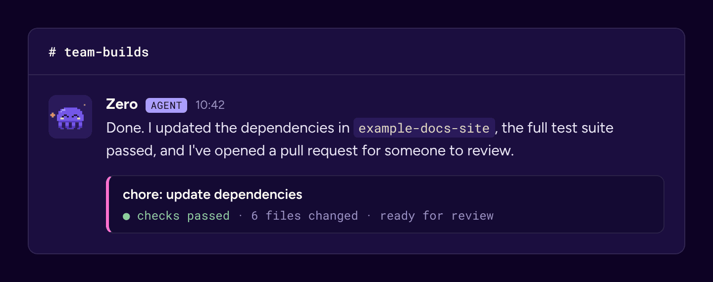
Zero isn’t only for fun. They’re becoming the face of the AI agents we build for our own tools. When one is busy, you’ll see Zero thinking. When it’s done, Zero bounces. If something breaks, Zero looks as worried as we do.
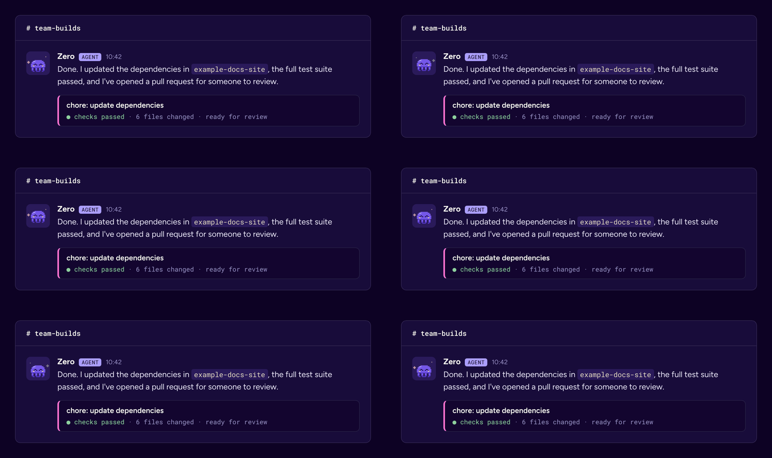
There’s one place you won’t find Zero: anywhere a customer might be dealing with a death. Zero is there to show who we are as a team, so they stay well away from anyone’s will or estate.
Built the way we build everything else
We designed all of this with AI, on shared design canvases, mostly in the gaps between other work. That meant we could try lots of ideas quickly and throw away the ones that didn’t land without anyone feeling bad about it.
Two things kept it on track. We started from the Octopus Legacy design system, so every colour and typeface traces back to the parent brand. And we wrote everything down, down to the position of every one of Zero’s pixels, so anyone on the team, or any agent we build, can draw Zero properly.
What’s next
Zero will almost certainly pick up a few more outfits, and the brand will keep growing with the team. If you’ve got ideas for Zero’s next costume, we’d love to hear them.
And if you’d like to be part of a team that makes this kind of thing in its spare time, take a look at our open roles.
Keep reading
All postshow we work · 3 min
Hello, world. We are death.tech